When one thinks of “User Experience” their first thought is about the customer. While that works, you also need to consider yourself, the owner, possibly designer and overall webmaster of this domain. Even if none of those titles apply to you, a website should not only be built for ease of use for the customer, but for those developing and maintaining the content too. While it may be bizarre to think, here are five tools you can look into that will not only make your life easier, but allow you to interact more with your customers too.
When considering a website, there are 5 main points (and 5 great apps and programs we have highlighted) that need to be considered. The framework, pictures, colors, fonts, and finally, the feedback.
1. The Framework
Project Comet- Adobe
Adobe is poised to take the market by storm with their innovative, easy to use tool. The first of its kind, Project Comet is a developers dream. It features an all in one dashboard and easy to use interface that allows you to work on your rough draft and prototype ideas quickly and easily. Pair that with Adobe’s cloud, and you have a tool that will keep you and your team connected all over the world. Sadly, we have to wait just a bit longer until it is released in the next few weeks!
2. Picking the Perfect Pictures
Pixabay
The old saying is “Content is King” in 2016, it is expected to stay that way. Yet, a picture can say 1,000 words. So what is a designer to do? Either swamp your customers with the 1,000 words of text or use beautiful, free, royalty free stock. In this day and age, finding a website that has a decent stockpile for most keywords. Pixabay is definitely where you should start your search.
3. What Colors Match Your Need?
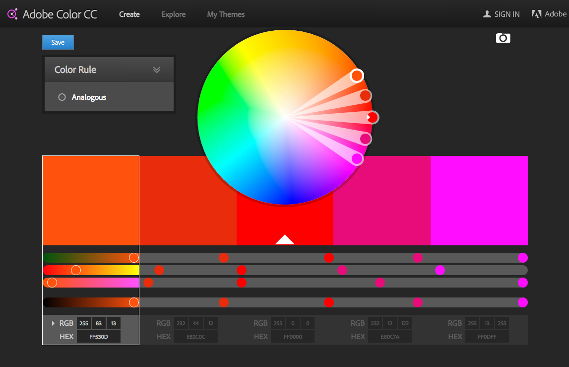
Adobe Color Wheel
For most designers, and customers alike, the color scheme of a website is the bane of their existence. You have the opportunity to make or break your design based on the colors you choose. A customer may be turned away if your content is too bright, or perhaps there is not enough contrast? Take away the guessing and use a sophisticated yet easy to use color wheel.
4. Finding a Font
Google Fonts & Type Genius
If colors weren’t, your undoing fonts might be. Both designers and customers have experienced websites that are jarring to the eye, or just the opposite, and keep you so interested in the text, you find yourself reading because you want to! Truly, the unsung hero is Google Fonts. With their massive database, you never have to worry about fonts that won’t render, or aren’t compatible. If you have a base font in mind, head over to TypeGenius and find the perfect combo. Both are free and awesome resources for the designer in all of us.
5. Collecting Feedback
UserTesting
Your website is in beta, which means you need an easy to use, intelligent way to gather your customer feedback about your website. You can collect reviews for products later, but you need to launch first! UserTesting is by far one of the most convenient ways to see multiple platforms, browsers, and how your website does with different internet connections. Users from all over the world will use your site, and have their screen recorded for you to see.
2016 is proving to be a big year for website designers and customers alike. With more responsive design, we can start to interact with products and menus in ways that were never thought possible. Truly, the internet is making shopping and browsing the web a more immersive experience every day.


